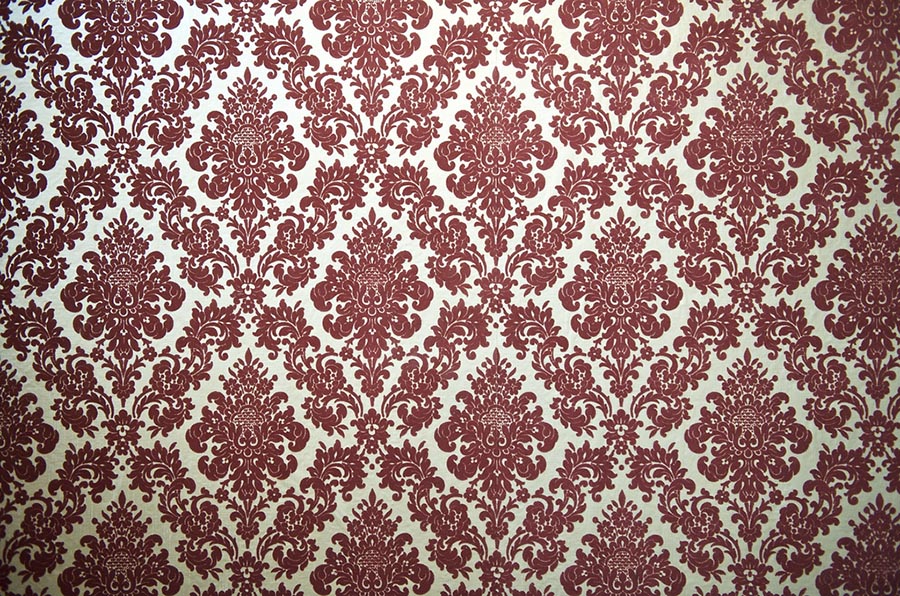
 Home design is a fickle thing. The ranch-style homes that were all the rage 30 years ago can look positively pedestrian today. Granite countertops, the ultimate sign of smart design just five years ago, have given way to soapstone and quartz. And wallpaper: Can you believe that homeowners in the not-too-distant past — if you are over 40, you’ll remember this — actually paid for velvet-flocked wallpaper? Nowadays it is ripped off the walls at first sight (if, heaven forbid, there’s any left).
With that in mind (shudder!), designers at the recent International Builders Show in Las Vegas outlined current trends in home design. If you’re a buying or building a home, here’s what to look for. If you’re selling your home, heed this advice to get the best price.
These tips come from the Builder Online website,which summarized advice from two presenters at the builders show: Denver-based interior designer Lita Dirks and Akron, Ohio builder Tony Crasi. The tips were intended for builders but are enlightening for the rest of us.
First, a list of home design don’ts:
Granite: Granite countertops may not be the “wow” factor with all buyers as they once were. For a different look, consider more uniform surfaces such as quartz or quartzite.
Overdone ceilings: Ceiling details can be a nice touch, but they can quickly become “overkill” if there’s too much of it.
Cramped laundry/mud rooms: These spaces, often located just inside from the garage, are becoming a priority for buyers. But they often are too small. The larger they are, the more comfortable they’ll seem and the more useful they will be as a storage area.
Oversized islands: An island doesn’t need to take up the entire kitchen. If it does, the kitchen may need its layout tweaked or have the extra square footage go to somewhere else in the house.
Pantry doors: The doors often look like any other standard door in the house. Instead, coordinate them with the kitchen cabinetry.
Tub versus shower: Many builders assume that all of their customers want a bathtub, but that’s not always the case nowadays.
Dirks and Crasi also urged builders to innovate more and work harder to meet the demands of style-conscious buyers. Savvy customers want a level of detailing that was unheard of a few years ago, Crasi said, and many builders today don’t realize how badly their homes are in need of a design upgrade. Here are seven suggestions:
Exterior: Curb appeal is important. Scale, proportion, and elements that fit the style of a home are critical to attract buyers.
Entryway: Make the front door and entryway inviting. The inside of the front door is important too, so make it pop with a colorful paint.
Laundry/mud rooms: The cramped mudroom entryway no longer cuts it. Buyers are looking for well-designed “drop zones” that take into consideration all the necessities of a busy life, such as cell phones, backpacks, sports gear, and schoolwork.
Great room: The all-in-one great room is still the epicenter of the home. Make it stand out with expansive windows. “Take them as far to the ceiling and floor as you can, and make them long and graceful,” Dirks said. “It gives you a more updated look.”
Fireplace: Make the fireplace part of a statement wall, with a striking mantel, beautiful surround, and stonework.
Kitchen island: Waterfall countertops provide a contemporary, clean look. Double islands make sense in larger kitchens because they provide a gathering space and a cooking space.
Master closet: Buyers want more than just a wire-closet system, Dirks said. “Buyers want help in figuring out how to organize their lives.”
(Image: Flickr/Thor)

