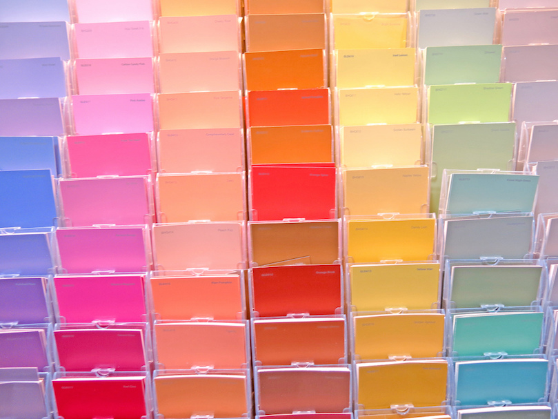
 Getting ready to paint your home? Walk into a typical paint or hardware store and be prepared to choose from more than 1,000 colors, tints, and shades. Who knew that picking the color for a few walls and maybe some trim could be such a difficult decision?
Relax. Along with the familiar cardboard color swatches, retailers today offer a variety of digital tools to help you pick the perfect interior color from your home computer or your iPad, iPhone, or Android device. Some tools allow you to visualize selected color schemes right on your own walls.
And there’s no shortage of opinions on what colors are “in” today — and likewise, what colors are “out.”
Just in case there was any doubt about what color you should never, ever choose for even the smallest space in your home, it is, by acclamation, Pantone 448C, Opaque Couché. The color is a drab greenish-brown, described by the London Daily Mail as “a dreary mix of tar, vomit and olive,” and it was identified by an Australian marketing company tasked with discovering the world’s most repulsive color. The Australian government intends to use it on cigarette packs in the hope of repelling buyers.
Other unpopular paint colors for home decorating — though not nearly as offensive as Pantone 448C — include orange, black, and violet, according to a recent survey of homeowners by Better Homes and Gardens. Intense reds and greens can also be off-putting.
So what colors do homeowners like? Sixty-two percent of survey respondents said they were most likely to use shades of blue in decorating. Homeowners generally prefer neutral interior walls, adding pops of color through accessories and furnishings.
If they were to use color, survey respondents said they would most likely use it in a family or living room (63 percent), a kitchen (53 percent), and a bathroom (52 percent). The areas where they were least likely to use color were in a foyer (36 percent), a dining room (24 percent), and an adult bedroom (24 percent).
Along with the survey, Better Homes and Gardens in March published its annual Color Palette of the Year. Here are its top picks for colors for 2016:
- PINK: Use it as a neutral paired with blues, blacks, and metallic accents.
- BLUE: Try a midtone blue, which offers a “big, gregarious personality.”
- GRAY: Show off a classic and contemporary look.
- GREEN: Mix it with a hint of silver to give a space a modern retro vibe.
- ORANGE: Love it or hate it, an energetic orange can pack a serious punch.
And when your colors are selected and it’s time to put paintbrushes to work, check out out this roundup of interior painting tips published on Pacific Union’s blog earlier this year. Good luck!
(Image: Flickr/torbakhopper)